Why every product needs a design system early
A small, opinionated set of tokens and components pays for itself within the first month — here is the minimum viable design system we start with.
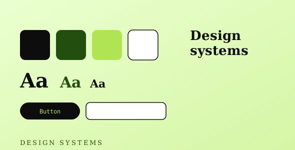
Design systems sound like a luxury for big teams. In practice, a tiny one saves time from week one. The goal isn't a 200-page Figma library — it's a handful of decisions made once so nobody re-litigates them on every screen.
Start with tokens
Colors, spacing, radius, and type scale. Define them as variables and use them everywhere. The moment a value is hard-coded in three places, changing it becomes a chore — and the UI starts to drift.
A dozen components is plenty
Button, input, card, badge, modal, table row. Build these well and most screens assemble themselves. Each new component should justify its existence; duplication is cheaper to fix than the wrong abstraction.
Consistency compounds
Every consistent decision is one the team doesn't have to make again. That's the real return: not prettiness, but velocity that holds up as the product grows.
Start with tokens
Colors, spacing, radius, and type scale. Define them as variables and use them everywhere. The moment a value is hard-coded in three places, changing it becomes a chore — and the UI starts to drift.
A dozen components is plenty
Button, input, card, badge, modal, table row. Build these well and most screens assemble themselves. Each new component should justify its existence; duplication is cheaper to fix than the wrong abstraction.
Consistency compounds
Every consistent decision is one the team doesn't have to make again. That's the real return: not prettiness, but velocity that holds up as the product grows.